

Why Mobile Optimization Matters More Than Ever
Mobile optimization is absolutely essential for SEO in 2025 for better ranking and credibility. If visitors find your mobile site hard to use, they will leave quickly, which increases your mobile bounce rate and signals to Google that your site doesn’t meet user needs.
“Over 60% of all organic search visits in the United States now come from mobile devices.”
Statista, 2024
Mobile-First Indexing Is Now the Standard
Google uses mobile first indexing, it primarily evaluates the mobile version of site to determine rankings. If site is not optimized for mobile devices, your SEO performance will suffer regardless of how good your desktop site is.
User Behavior Has Shifted to Mobile
Today, most users browse the internet on their phones, especially when searching for local businesses, services and shopping. A mobile friendly website with fast load times, easy navigation, and responsive design gives better user experience.
If you want to improve your rankings, attract more visitors, and stay competitive in 2025, mobile optimization isn’t optional it’s a must.
How to Optimize Your Website for Mobile SEO
The majority of searches occur on smartphones, whether someone is craving sushi or needs a nearby locksmith, they are likely searching from their mobile device. That is why making your website mobile friendly is not just good practice, it is essential for Search Engine Optimization.
Here is how to see how many people use their phones to find you locally and what you can do to give them the best experience possible.
1. Check Your Mobile Traffic and Local Searches
Start by checking your mobile traffic data. Tools like Google Analytics can show you how many visitors land on your website using their phones. You can even segment it by city or ZIP code to understand your local mobile audience.
If you are using SEMrush or another SEO platform, look at your local keyword rankings on mobile vs desktop. You might be surprised by how much visibility comes from smartphones.
2. Use Responsive Design Across Devices
A responsive design ensures website looks good on all screen sizes, from the newest iPhone to older Android models. This means that text, images, and layouts automatically adapt without forcing users to zoom in or scroll sideways.
Use Google’s Mobile Friendly Test Tool to check your site. If it’s not responsive, talk to your developer or switch to a mobile optimized website theme.
3. Improve Mobile Page Load Speed
Page speed is a big deal for both SEO and user experience. People will not wait more than a few seconds for your page to load, especially when they are on the go.
Use PageSpeed Insights to test how quickly your pages load on mobile. Aim for a score above 80. Compress images, use caching, and eliminate unnecessary scripts to improve load times.
4. Format Text for Small Screens
Tiny text is a common mobile design mistake. If people have to pinch and zoom to read your content, they will bounce and Google will notice.
Keep font sizes at least 16px, and use clear, high-contrast colors. Short paragraphs and bullet points also improve readability on mobile.
5. Design Tap-Friendly Buttons and Links
Ever try tapping a link and accidentally hit the wrong one? That is a sign tap targets on a site are too small or too close together.
Make sure your call-to-action buttons, such as ”Call Now” or ”Get Directions,” are large enough for thumbs and spaced far enough apart. Google recommends a minimum touch target size of 48×48 pixels.
Tools to Evaluate Mobile-Friendliness
Check your website with mobile-friendliness tools to test for technical SEO. These free tool tells you if your site meets Google’s mobile usability standards.
Google’s Mobile-Friendly Test
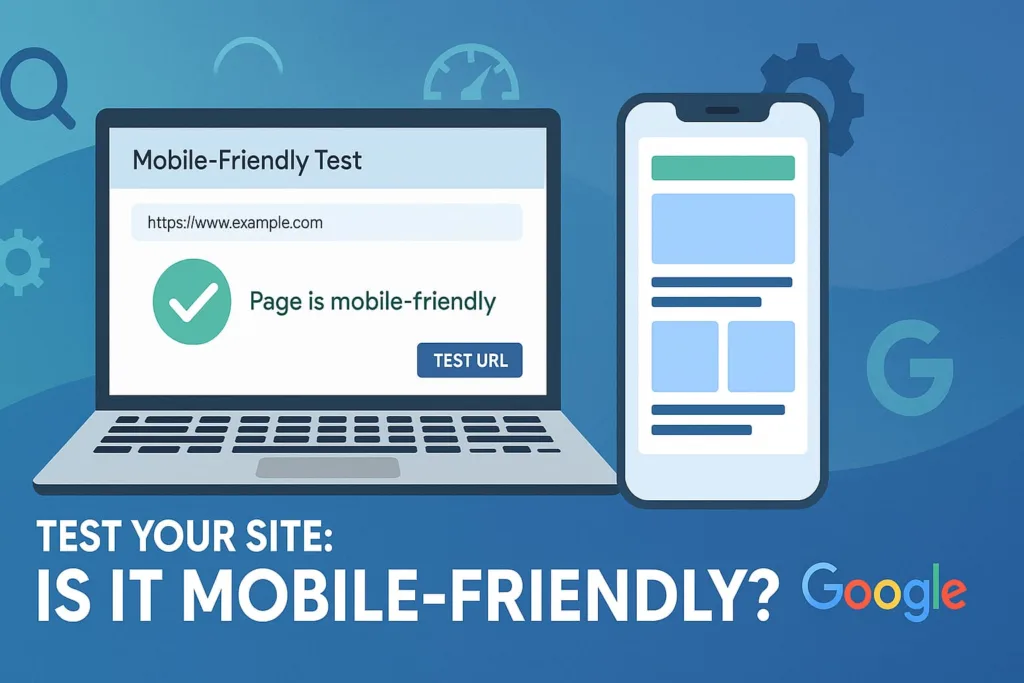
bile-Friendly Test, enter your URL, and let it analyze your site. If there are problems like tiny text, slow load times, or unclickable buttons Google will show you exactly what to fix.
PageSpeed Insights for Mobile
Google PageSpeed Insights is a tool from Google which analyzes the performance of your website on mobile as well as desktop devices. It provides a mobile-specific report that shows how fast your site loads on smartphones and gives practical suggestions to make it faster.
Don’t Hide Content from Google’s Mobile Bots
Many websites still use different versions for desktop and mobile, and sometimes the mobile version hides important content like reviews, contact info, or product details. That’s a mistake.
Don’t hide important stuff from Google on mobile. With mobile-first indexing, Google primarily looks at your mobile version when deciding how to rank your site. So, whatever you want Google and users to see must be clearly visible on mobile.
Best Practices for Mobile-First Web Design
A mobile-optimized site is not just a smaller version of your desktop site it’s a different experience. So, when you are planning a redesign or launching a new site, think about mobile users first when you design.
Ask yourself:
- Can users find what they need in one or two taps?
- Is your phone number clickable?
- Do your buttons stand out?
Start with mobile wireframes instead of desktop ones. That mindset shift can make all the difference.
Keep Layouts Clean and Intuitive
Less is more when it comes to mobile design. Avoid cluttered menus, pop-ups, or too many call-to-action buttons. Instead, keep your mobile site simple and easy to use.
Simplify User Navigation
Use large, readable fonts, clear navigation, and minimal distractions. The goal is to help users get the info they need fast without zooming, scrolling endlessly, or giving up.
Future-Proofing Your SEO Strategy for Mobile
Mobile usage is not slowing down. If anything, it’s growing, especially with voice search, local discovery, and mobile shopping becoming the norm.
Invest in Mobile Content and Structured Data
you need to plan for mobile to stay super important in the future.
- Invest in a mobile-first SEO strategy now.
- Keep improving website speed
- Use structured data.
- Create mobile-friendly local content.
- Monitor mobile rankings separately from desktop.
Staying ahead now means staying visible tomorrow.
Mobile SEO Is No Longer Optional
Mobile SEO is more important than ever as more people rely on their phones to search, shop, and connect locally. It’s crucial to see how many people use their phones to find you locallyand ensure your site gives them a seamless experience.
Start by making your website adjust to fit any phone screen, so it looks great no matter the device. You also need to test how quickly your pages load on mobile, because slow sites drive visitors away fast.
Don’t overlook the basics make text easy to read on small screens and ensure buttons and links are easy to tap to avoid user frustration. Tools like Google’s Mobile-Friendly Test help you check your website for issues and make improvements.
Plus, be sure you don’t hide important stuff from Google on mobile, or your site could lose rankings. With more traffic coming from smartphones, you must think about mobile users first when you design, focusing on clean layouts and fast access to information.
A good rule of thumb is to keep your mobile site simple and easy to use, reducing clutter and distractions. Finally, plan for mobile to stay super important in the future because mobile is not just a trend, its how people experience the web today.